In this article, you will learn the best web form design. Before heading up, I want to share, how these guidelines helped me to grow professionally. And it might help you too.
I was in the meeting, discussing project design. One thing, I have noticed, your manager and customer do not bother what goes into the background. They are more concerned about what does your application looks like to the end user. And everyone loves if it is simple, user-friendly, neat and clean.
Being a developer, your aim is to give the best experience to the end user using your application.
There are so many components on the web page. If I think from the end-user perspective, Web form comes first to me.
How can simple HTML web form make a big difference to your business?
With your website or application, whether you are selling a product or providing services, a user interacts with you through the HTML web form that you have on your website.
There is ZERO business if the end user doesn’t click on the submit button. This is a fact. Neither you can deny nor me.
And yes, you should definitely work on your web form.
I found some patterns and practices of the best web form design. This is after jumping into the multiple websites form and trying to think from an end-user perspective.
What are those factors in HTML web form designing makes the user more likable? What are the Do and Don’t for while developing the best web form design?
Best Web Form Design:
Here is the list of best practices to follow to design an HTML web form.
All the elements in the form should be in a single column.
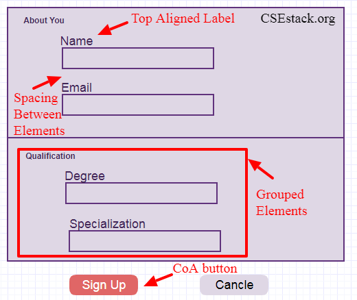
Labels to all the elements in the form should be top aligned.
Make the group of input and label for each element with appropriate spacing.
The space between the group should be higher than the space within the group element.
Try to avoid using all caps letters in the label string (unless caps have semantic meaning).
Usually, a word with all caps is difficult to read and scan.
The readability score is more important. Using standard practice makes your design more readable and scannable. It also helps you with automation. Following standard practice makes easy identification of web form elements by any automation framework for testing.
If you have enough space and options are less than 6, prefer writing all the elements inside the form rather than creating a drop-down list.
Use the drop-down list, if you are asking a user to choose one from more than 6 options.
If you have options more than 25, use contextual search text in drop down. It is easy to design using a JavaScript code snippet.
Avoid using the label as a placeholder. When the user puts the cursor inside the text area, label vanishes. It’s not good user experience.
Do you have checkboxes in your web form? Put all the checkbox options vertically.
The ultimate goal of the web developer is to keep watch on a number of users submit the form. So make the Call of Action (CoA) button more descriptive.
Ex. If you are asking a user to sign in to your application, use “Sign Up”, instead of “Submit”. For e-commerce application, use the “Buy Now” button text.
Display the error inline. It will be hectic for the user if you specify all the error on the form after clicking on CoA button.
Ex. If the email is already enrolled, the prompt user asking to add another email id before submitting the form.
Use JavaScript validation for each text fields.
Ex. Email is a specifically formatted string <username>@<domain_name>. Validate the email input field using JavaScript. It can be easily validated using regular expressions.
If your help text is smaller, prefer writing it below the label. For complex and large texts, place the help text next to input which will be visible in its focus state.
If there are two Call of Action buttons, differentiate them with the appropriate color. Philosophia is to give both the option to the user but make them more inclined to click on the favorable one.
Make the text field size appropriate to the user input length.
Ex. For the India region, if there is a postal zip code field in your form, make it as the size of 6 characters.
Don’t use * in the form. Keep the input by default compulsory. If the input is not mandatory, write “optional” in front of the label. The optional text should be written in a lighter color.
Group the form elements based on the category they belong to. Writing all the elements without group overwhelm the user. So it is one of the best web form design if your form is long with many input elements.
It is a philosophical difference. The user feels completing the form faster if the elements are grouped.
Ex. In the above image, we have grouped the elements into two groups – “About You” and “Qualification”.
After submitting the form, display webpage with all the information user has put into the form. Add the print button to the web page which will allow the user to print or save the HTML page as PDF.
Avoid using horizontal scrolling.
Last but not least, choose proper color combinations for form elements that suit your website theme design.
You can create the web form using simple HTML and CSS code.
Once you created a web form with all the required fields, it is your job now to follow these best practices. Most of these practices can be implemented by adding simple CSS and JavaScript lines of code.
Hope you find this web form guide useful for your web designing. These are the basic and standard guidelines. Choose and adapt as per you feel more comfortable with your end user.
You may have your thoughts on best web form design. You can spill your thoughts and web designing secrets in the comment below the post.
I am a Python enthusiast who loves Linux and Vim. I hold a Master of Computer Science degree from NIT Trichy and have 10 years of experience in the IT industry, focusing on the Software Development Lifecycle from Requirements Gathering, Design, Development to Deployment. I have worked at IBM, Ericsson, and NetApp, and I share my knowledge on CSEstack.org.


typo in the cancel button
Thanks for informing.